
Context
François Behague, a recognized coach on Malt, had a landing page created by another agency. Despite a lot of traffic, the page wasn't converting enough. The design lacked personality and did not embody her personal branding. To improve results, it was necessary to completely rethink the structure, design, and discourse of the page.

“After having coached more than 140 freelancers on their acquisition of missions, I needed a site that really reflected my method, my expertise and my universe. The result is top notch: a site that converts well, a very simple handling. Frankly, when you spend your days advising freelancers, you are doubly grateful to find professionals who understand your needs directly!”
Issues
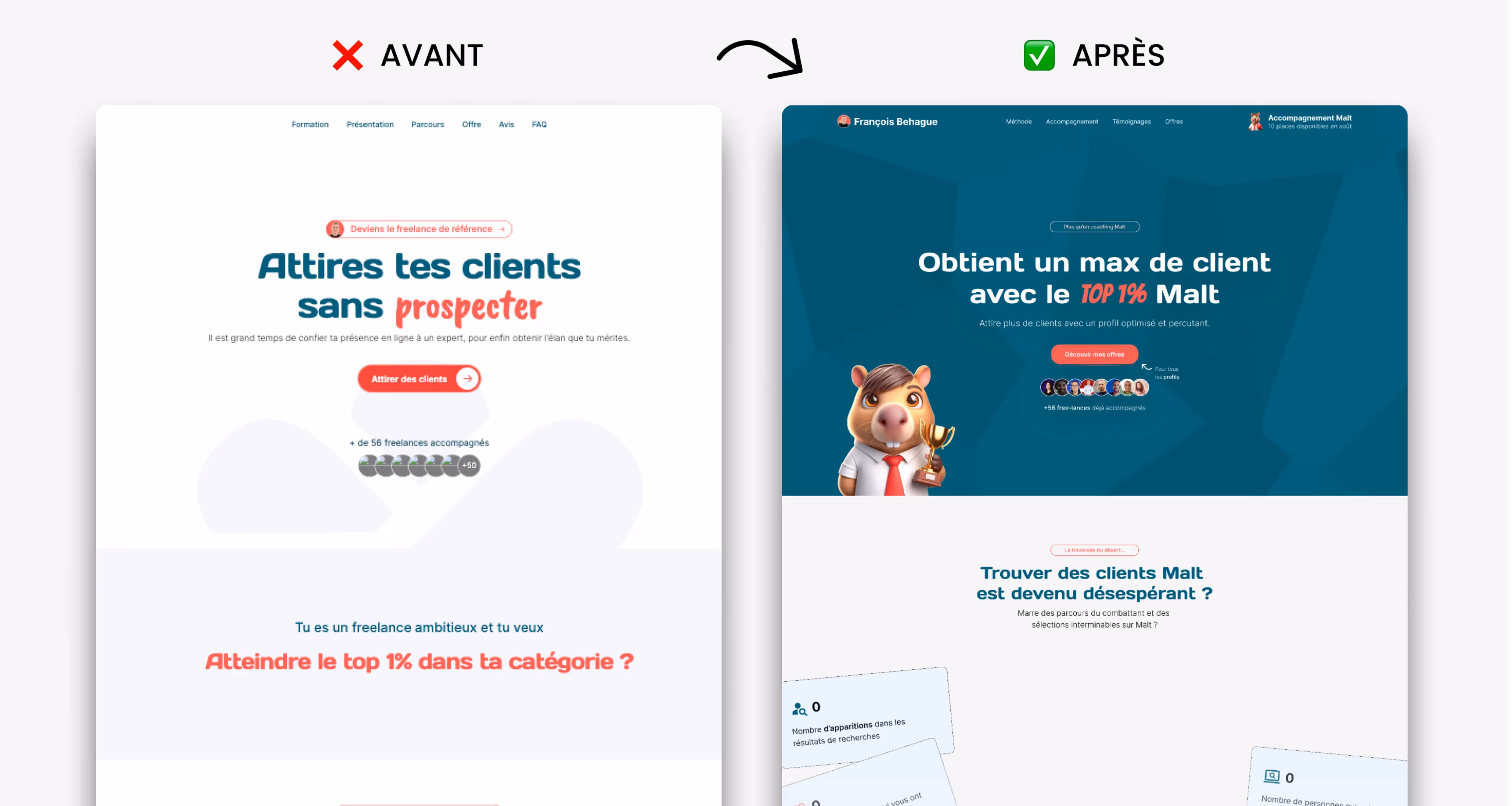
The initial design of the page suffered from a lack of visual impact and a fragile UX structure. François' value proposition was not highlighted enough, while the absence of personal branding elements prevented the creation of a strong bond with visitors. The CTA, which was discreet and not very engaging, limited conversions. Finally, coaching offers were too restricted, which reduced their attractiveness.
Objectives
The mission was to rethink the architecture of the landing page to make it easier to read and to clarify the hierarchy of information. It was also a question of making the CTA much more visible and encouraging, to expand coaching offers to meet different profiles and to anchor the page in François' personal universe in order to create an immediate relationship of trust with his visitors.
Solutions
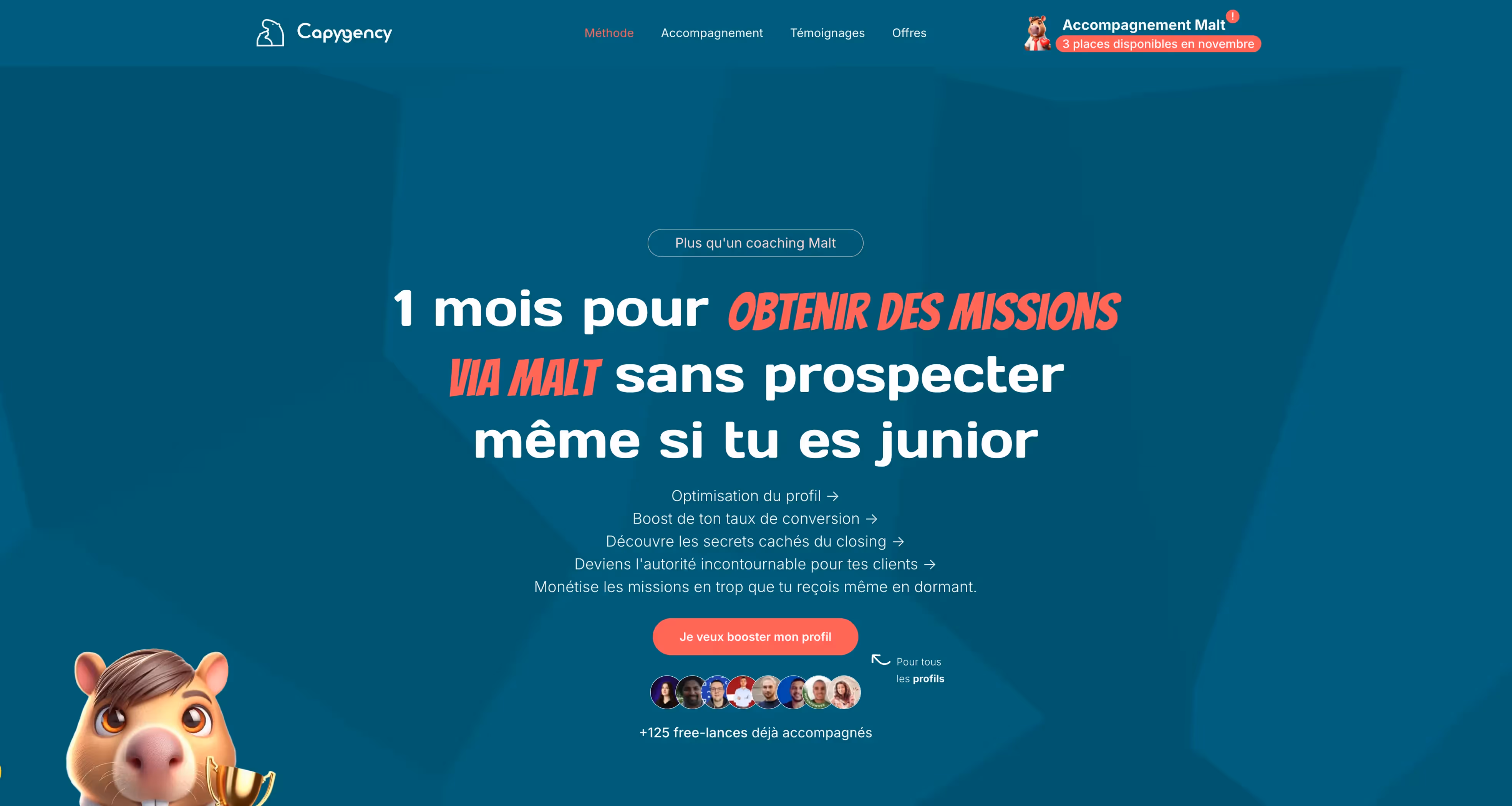
We restructured the page around a clear and gradual journey, starting with a compelling and differentiating value proposition. The design has been reworked to highlight François's personality and personal branding, with consistent visuals and an assertive editorial tone. Offerings have been enriched and presented in a more legible manner, while CTAs have been repositioned strategically and visually strengthened.
Impact/Results
The new landing page achieved +12% conversions in just one month. François' image is now better embodied, his expertise is highlighted and the page fully plays its role: to transform visitors into qualified prospects.